Blue Wallpaper: From Porcelain to Navy, Which Shade Suits Your Room?
Blue is the color people reach for when they want calm, and the one they worry about most. Done well, a blue room feels serene and settled.

Words by
Marketing Controller
I lead a team of product and brand developers, shaping ideas into rooms that people actually want to live with. With a background and passion in interiors, I’m drawn to how design meets real life what works, what doesn’t, and why. Here, I share thoughts on products, brands, and how to curate them to create a home you truly love.
Blue wallpaper works in almost any room if you match the depth of the blue to the light and the mood you want. Light blues open up small or dim spaces, mid blues suit living rooms and kitchens, and deep blues bring intimacy to bedrooms and dining rooms. Pair it with warm woods and brass so it never feels cold.
Blue is the color people reach for when they want calm, and the one they worry about most. Done well, a blue room feels serene and settled. Done without thought, it can feel chilly, especially in a room that never gets direct sun. The difference is rarely the blue itself. It is the depth you choose, the pattern it sits in and what you put next to it.
The Martha Stewart wallpaper collection at No Two Houses gives you four blues to work with, and they move neatly from light to deep: Porcelain Blue, Grey Blue, Mineral Blue and Tarn. This guide walks through them in that order, then covers pairings and room-by-room advice so your blue feels warm from the first roll.
Which blues are in the Martha Stewart wallpaper collection?
The collection has 41 designs, and four of its colorways are blue. Each appears across several patterns, so you can choose the depth of blue first and the design second. Every paper in the collection is non-woven, paste-the-wall and spongeable, sold in rolls of about 20.5 in × 32.8 ft (52 cm × 10 m).
Colorway | Relative depth | Designs available |
Porcelain Blue | Lightest of the four | Floral Vine, Chateau Fleur |
Grey Blue | Light to mid | Garden Stripe |
Mineral Blue | Mid | Classic Stripe, Artisan Floral, Wood Panel, Bedford Faux Bois |
Tarn | Deepest of the four | Florentine, Jacobean, Heritage Garden Stripe |
Browse the whole range on the Martha Stewart wallpaper collection page, or filter the wider store by blue wallpaper and navy wallpaper to compare it against other brands.
What is the lightest blue wallpaper in the collection?
Porcelain Blue is the lightest of the four blues, and it is the one to choose when you want the feeling of blue without a strong color presence. It appears in two designs. Martha Stewart Floral Vine Porcelain Blue has twisting vines with delicate blooms and small birds, with a rhythmic flow that reads as gentle movement across a wall. Martha Stewart Chateau Fleur Porcelain Blue is a traditional damask with a delicate lattice-like structure, so it brings order and a quiet formality.
Light blue wallpaper of this kind suits rooms where you want air and softness: a bedroom, a guest room, a powder room or a hallway that needs lifting. Because the color is restrained, the pattern does most of the talking, which makes Porcelain Blue a good first blue for anyone nervous about committing.
Which blue sits between light and mid?
Grey Blue is the next step up in depth and it belongs to one design, Martha Stewart Garden Stripe Grey Blue. Garden Stripe pairs a delicate classic stripe with floral sprigs, so you get the structure of a vertical line and the softness of a botanical in one paper.
This is the blue to consider when a pure light blue feels too sweet but a mid blue feels like too much color. Stripes also carry a practical benefit: vertical lines draw the eye upward, which is useful in rooms with standard 8 ft (2.4 m) ceilings. A Grey Blue stripe in a bedroom or dressing room gives you calm, height and a little romance without tipping into any one of them.
What does a mid blue wallpaper look like across different patterns?
Mineral Blue is the mid-depth blue and the most versatile in the collection, because it appears in four very different designs. That lets you choose the mood of the room through pattern while keeping the color constant.
- Martha Stewart Classic Stripe Mineral Blue: a broad stripe with a smart, timeless look that accentuates the height of a room. Use it where you want crispness, such as a dining room, a study or a hallway.
- Martha Stewart Artisan Floral Mineral Blue: a delicate pattern inspired by traditional block print textiles, with a repeating botanical motif in a neat, rhythmic arrangement. It suits bedrooms and sitting rooms where you want pattern that stays polite.
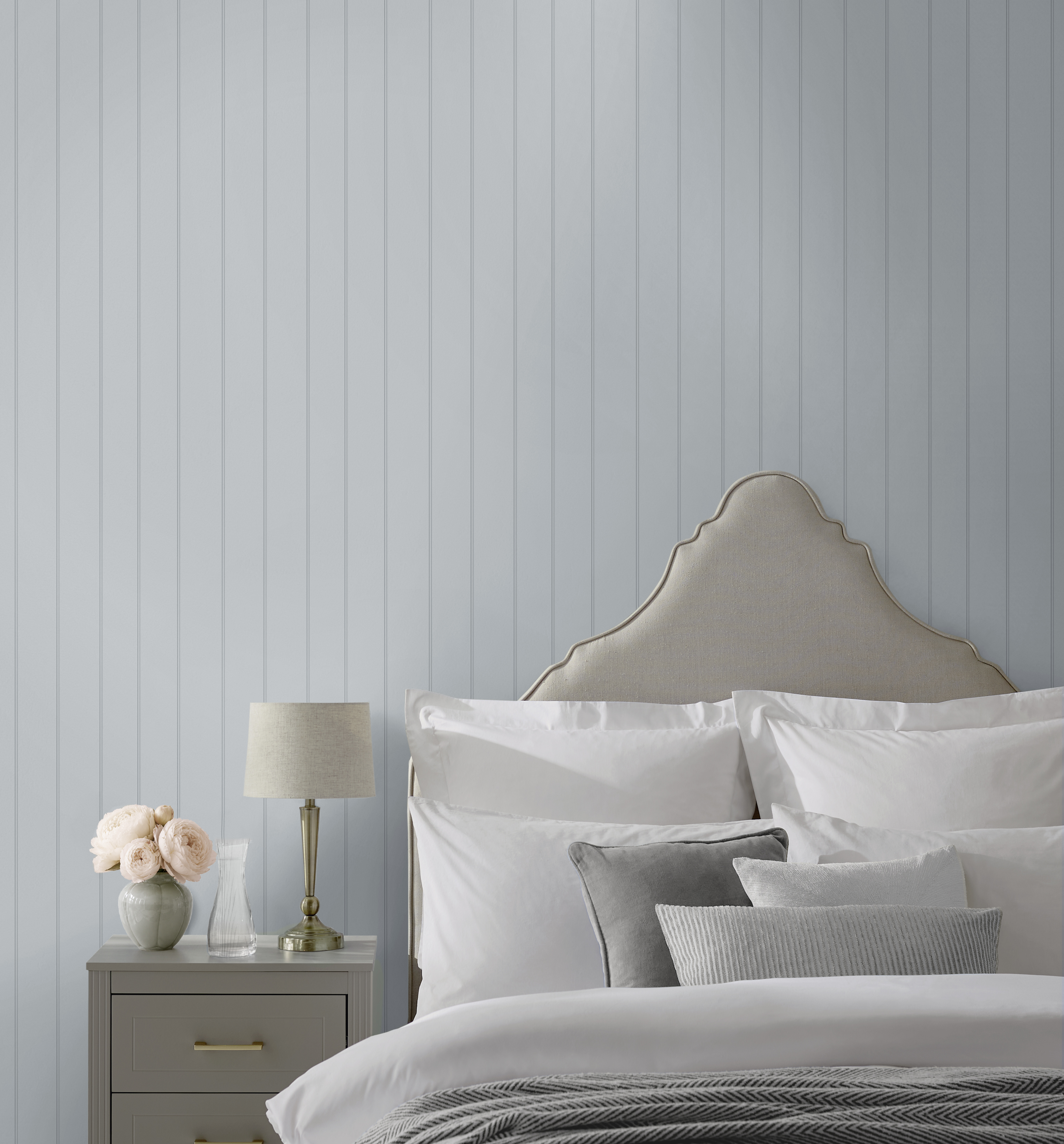
- Martha Stewart Wood Panel Mineral Blue: captures the charm of traditional paneling in a printed design, with a free match that makes it forgiving to hang. Ideal for a hallway, mudroom or below a chair rail.
- Martha Stewart Bedford Faux Bois Mineral Blue: softly grained wood panels in a smooth printed finish. A quieter take on paneling for living rooms and home offices.
Which is the deepest blue wallpaper, and does it count as navy?
Tarn is the deepest blue in the collection and the one to reach for when you want drama, intimacy or a cocooning feel. It appears in three designs: Martha Stewart Florentine Tarn, an intricate, archival-inspired floral and foliage damask with antique charm; Martha Stewart Jacobean Tarn, a detailed design inspired by traditional botanical patterns with a generous 33 in (84 cm) repeat; and Martha Stewart Heritage Garden Stripe Tarn, with ditsy florals woven into elegant vertical stripes.
Shoppers searching for navy blue wallpaper often want this kind of depth. Whether Tarn reads as navy in your room depends on your light and the colors around it, which is exactly why a sample matters. If you want to compare it against papers sold specifically as navy, the navy wallpaper category puts them side by side. Deep blues like Tarn reward a confident approach: paper all four walls of a dining room or bedroom rather than one, so the room feels enveloping rather than lopsided.
What colors go with blue wallpaper?
The quickest way to keep blue from feeling cold is to put something warm beside it. Blue sits opposite orange on the color wheel, so the warm, earthy end of that family, from ochre and russet to oak and brass, makes blue feel richer rather than cooler. The table below gives you a starting point for each of the four Martha Stewart blues.
Pairing | Best with | Why it works |
Crisp white trim and ceilings | Porcelain Blue, Grey Blue | Classic blue and white; keeps light blues fresh and defines the architecture |
Warm woods (oak, walnut, chestnut tones) | All four, especially Mineral Blue and Tarn | Adds warmth and texture; grounds the blue |
Brass and antique gold metals | Mineral Blue, Tarn | Warm metallic glow lifts deeper blues, particularly in evening light |
Ochre and mustard textiles | Grey Blue, Mineral Blue | A near-complementary that makes blue look deliberate, not default |
Russet, terracotta and rust | Tarn, Mineral Blue | Earthy warmth balances the depth of the darker blues |
Greens (sage, moss, olive) | Porcelain Blue, Mineral Blue | Adjacent on the wheel, so the scheme feels layered and natural |
A few practical notes on applying this:
- Pick one warm partner and repeat it. A brass lamp, a brass mirror frame and brass curtain hardware do more together than three different warm accents.
- Match the depth of the partner to the depth of the blue. Light blues want soft, bleached woods and off-whites; Tarn can take dark walnut and burnished metals.
- Let green do the softening. If you like blue but find a blue-and-white scheme too crisp, bring in sage or moss through upholstery or plants. For a wall-color alternative, see our guide to sage green wallpaper.
- Use brown as a bridge. Leather, rattan and wood tones make blue feel lived-in, and our brown wallpaper guide covers how the collection's wood-effect papers do that job on an adjoining wall.
[IMAGE: file="blue-wallpaper-pairing-flatlay-brass-ochre-oak.webp" alt="Flat lay of a Martha Stewart Florentine Tarn wallpaper sample beside brass hardware, an ochre linen swatch and an oak wood sample"]
Which blue wallpaper works in a north-facing room?
A north-facing room receives indirect light all day, which tends to push colors cooler and flatter. Blue is not off limits here, but the depth and the pairing matter more than in a sunny room.
- Go lighter or go deeper, not in between. Porcelain Blue keeps a dim room feeling open, while Tarn turns the lack of light into an asset by making the room deliberately intimate. Mid blues can look washed out in flat light unless you warm them up.
- Warm every other surface. Choose a warm white for trim rather than a cool one, bring in oak or walnut furniture, and use brass rather than chrome.
- Light the walls. Picture lights and wall sconces with warm bulbs bring pattern forward in the evening and counteract the gray cast of daylight.
- Order a sample and tape it to the wall for at least a day. Look at it in the morning, at midday and with the lamps on before you decide.
South-facing rooms do the opposite and warm colors up, so a mid blue like Mineral Blue will hold its depth and a light blue will look soft rather than icy.
How do I use blue wallpaper in a bedroom, living room or dining room?
Blue wallpaper bedroom schemes are the most searched for a reason: blue is restful. Porcelain Blue and Grey Blue suit bedrooms where you want brightness, and Tarn suits those where you want to shut the world out. Our bedroom wallpaper ideas article covers layout options, including papering behind the bed.
Living rooms take mid blues well because they balance daytime use with evening relaxation. Martha Stewart Bedford Faux Bois Mineral Blue or Artisan Floral Mineral Blue give you pattern that will not compete with art and books. If you are papering one wall only, our guide to which wall should be a feature wall explains how to choose it.
Dining rooms and powder rooms are where deep blue earns its reputation. Florentine Tarn or Jacobean Tarn on all four walls, with candlelight and brass, is a classic for good reason. Smaller rooms can take the drama because you are not in them for long.
[IMAGE: file="martha-stewart-florentine-tarn-dining-room-wallpaper.webp" alt="A dining room with all four walls in Martha Stewart Florentine Tarn, a walnut table and brass candlesticks"]
Is blue wallpaper easy to hang?
Every Martha Stewart design is paste-the-wall on a non-woven substrate, which means you paste the wall rather than the paper, hang dry lengths straight from the roll and avoid soaking times. Our explainer on what paste-the-wall wallpaper is covers the method, and the how to hang wallpaper guide walks through it step by step. One point specific to deeper blues: dark papers can show white edges at the seams if the wall behind is pale, so some decorators tint the wall or run a matching colored pencil along cut edges. The papers are spongeable, so light marks from hanging can be wiped away with a damp sponge.
Frequently asked questions about blue wallpaper
Does blue wallpaper make a room look smaller?
Light blues such as Porcelain Blue tend to make a room feel more open, while deep blues such as Tarn make it feel more enclosed and intimate. Neither is wrong; choose based on the mood you want rather than the square footage.
What is the difference between blue and navy wallpaper?
Navy is simply the deep end of the blue range. In the Martha Stewart collection, Tarn is the deepest blue and is the closest match for anyone searching for navy blue wallpaper, though how dark it reads depends on your light.
Can I mix two blues in one room?
Yes, and the collection makes it easy because the same colorway runs across several patterns. Try Martha Stewart Classic Stripe Mineral Blue below a chair rail with Artisan Floral Mineral Blue above, or keep one blue on the walls and introduce the second through textiles.
What white goes with blue wallpaper?
A warm white with a hint of cream flatters most blues and stops blue and white wallpaper schemes from feeling clinical. Save brilliant, cool whites for sunny rooms where you want maximum crispness.
Are the Martha Stewart blue wallpapers washable?
They are spongeable, which means light marks can be wiped with a damp sponge. They are not sold as washable or scrubbable, so treat them as decorative papers rather than hard-wearing surfaces.
Ready to find your blue? Order samples first
The right blue is the one that still looks right in your room at dusk, so start with samples. Every design in the Martha Stewart wallpaper collection has an order sample option on its product page. Pick one from each depth that appeals, from Porcelain Blue through Grey Blue and Mineral Blue to Tarn, tape them side by side on the wall you plan to paper and live with them for a day or two. Then browse the full blue wallpaper range at No Two Houses to see how they compare with the rest of the store.
