Brown Wallpaper: How to Use Warm Neutrals Beyond Beige
Brown wallpaper works as a warm neutral when you treat it as a range rather than a single color. Start pale with Natural, Taupe and Linen, move through Ochre and Antique Gold, then finish with Russet and Chestnut. Pair it with cream, sage, muted blue or black, and let the room's light decide how deep you go.

Words by
Creative Brand Manager
I’m a creative Brand Manager with a strong foundation in designing and marketing beautiful products for the home. With a background rooted in design, I’ve spent much of my career exploring how aesthetics and functionality come together to shape the way we live. I’m deeply passionate about the evolution of interior trends, how they emerge, how they influence our spaces, and ultimately how products find their place within the home. For me, it’s not just about creating something visually appealing; it’s about understanding how people use, experience, and connect with the pieces around them every day. Through my work, I aim to bridge the gap between design and real-life living, bringing thoughtful, trend-aware products to life while telling the stories behind them.
Why is brown wallpaper the warm neutral worth reconsidering?
Beige and gray have carried neutral schemes for a long time, and both can leave a room feeling polite rather than lived in. Brown does something different. It holds warmth the way wood, leather and clay do, so a space reads as settled and generous instead of pale and careful. In the Martha Stewart wallpaper collection, brown is not one shade but a family of colorways that runs from barely-there Natural to deep Chestnut. That spread is what makes it useful: you can keep a room airy or make it enveloping with the same underlying tone. For the wider range across the site, browse brown wallpaper and neutral wallpaper.
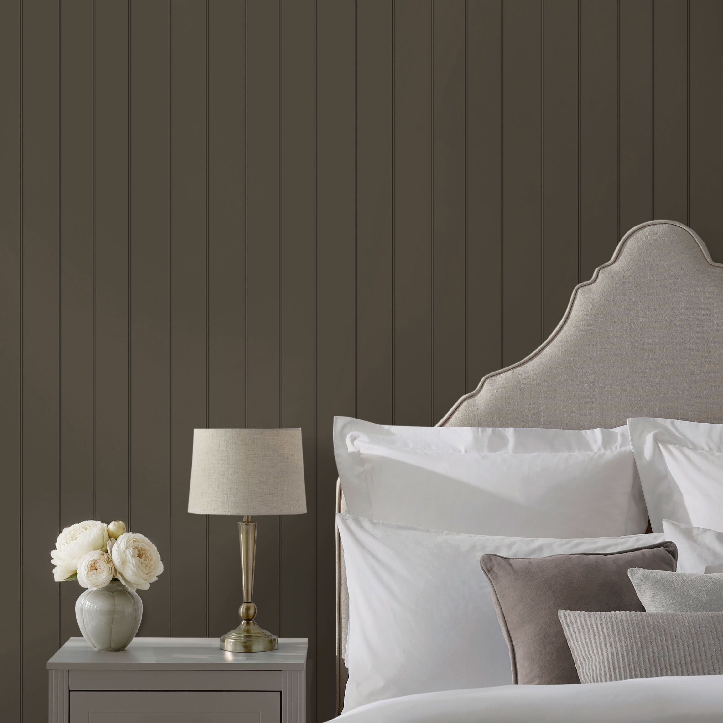
How do you build a brown wallpaper palette from pale to deep?
The simplest way to plan brown wallpaper is to think in three steps: pale, mid and deep. Each step changes the mood of the room, and the Martha Stewart collection has designs at every stage, so the pattern can stay consistent while the depth shifts.
- Pale: Natural, Taupe and Linen. These are the colorways that keep brown feeling light and open. They suit smaller rooms, north-facing rooms and anyone easing out of beige.
- Mid: Ochre and Antique Gold. Warmer and sunnier, these sit between neutral and color. Use them where you want brown to glow rather than ground.
- Deep: Russet and Chestnut. The richest end of the range. Russet leans red and earthy; Chestnut is a full, cocoa-dark brown. Both make a room feel cocooned.
Where do you start with pale browns like Natural and Taupe?
Pale brown is the gentlest entry point. Martha Stewart Bedford Faux Bois Natural gives the look of softly grained wood panels in a smooth, printed finish, so a wall gains texture to the eye without any physical relief. Martha Stewart Wood Panel Natural does something similar with the look of traditional paneling. If you prefer pattern over wood, Martha Stewart Florentine Taupe brings an intricate floral and foliage damask with an antique feel, and Martha Stewart Garden Stripe Linen pairs a delicate stripe with floral sprigs. All of these read as neutral from across the room but carry far more warmth than a plain beige paint.
How do Ochre and Antique Gold act as a bridge?
Ochre and Antique Gold are the colorways that move brown toward color without losing its neutral manners. Martha Stewart Garden Stripe Ochre and Martha Stewart Chateau Fleur Ochre bring a sunlit, mustard-adjacent warmth that flatters wood floors and brass. Antique Gold appears across Classic Stripe, Florentine, Jacobean, Artisan Floral and Floral Vine, so you can carry the tone from a tailored stripe in a hallway to a full damask in a dining room. Think of these as the connective tissue of a brown scheme: they tie a pale Natural room to a deep Russet one when you want the whole house to feel related.
When do you go deep with Russet and Chestnut?
Russet wallpaper and chestnut wallpaper are for rooms you want to feel enclosed and intentional. Martha Stewart Wood Panel Chestnut has the timeless charm of traditional paneling in its deepest colorway, and because it is a free-match design it is forgiving to hang. Russet runs through five designs: Martha Stewart Florentine Russet for antique damask, Martha Stewart Floral Vine Russet for twisting vines and birds, Martha Stewart Chateau Fleur Russet for a lattice-like damask, Martha Stewart Jacobean Russet for detailed botanicals, and Martha Stewart Heritage Garden Stripe Russet for ditsy florals in vertical stripes. That is a lot of range within one color, from a quiet stripe to a full-wall statement.
What colors go with brown wallpaper?
Brown is more sociable than people expect. The trick is to decide whether you want to soften it, sharpen it or warm it further, then pick the partner that does that job. The table below gives the pairings that work most reliably with the Martha Stewart colorways.
Brown tone | Pair it with | Effect | Where it works |
Natural, Linen | Chalky white, cream, pale oak | Light, airy, barely-there warmth | Bedrooms, small living rooms, north-facing rooms |
Taupe | Soft gray, dusty pink, aged brass | Calm and slightly formal | Guest rooms, powder rooms, entry halls |
Ochre, Antique Gold | Deep green, inky navy, walnut | Rich and sunlit | Dining rooms, studies, hallways |
Russet | Sage, olive, cream, black accents | Earthy and grounded | Dens, dining rooms, snug sitting rooms |
Chestnut | Cream, camel leather, brass, muted blue | Enveloping and tailored | Studies, dens, primary bedrooms |
A few partnerships deserve a closer look. Green is the natural companion to brown because the two sit together everywhere in nature; a Russet damask with sage woodwork feels instantly resolved. Blue cools brown down and keeps a deep scheme from feeling heavy, which is why Chestnut with a muted blue sofa works so well; see the guide to blue wallpaper for the blue end of the palette. Cream and white are the safety net: they lift every brown on this list.
- Trim and baseboards: paint them a warm white or cream rather than brilliant white, which can make brown look muddy by comparison.
- Metals: brass and bronze warm the room further; black iron adds a crisp edge to Russet and Chestnut.
- Textiles: linen, wool and leather all deepen the sensory warmth that brown wallpaper sets up.
- Flooring: mid-tone wood is the easiest partner; with very dark floors, keep the wallpaper to the pale or mid range so the room does not close in.
Which rooms suit brown wallpaper best?
Brown has a reputation as a den color, and it earns it, but it is far more versatile than that. The deciding factors are how much natural light the room gets, how long you spend in it and whether you want it to feel open or enclosed.
How do you use brown wallpaper in a den or snug?
A den is where deep brown wallpaper is most at home. Martha Stewart Wood Panel Chestnut on all four walls turns a plain box into something closer to a paneled library, and the free match means the look is continuous rather than obviously repeated. Keep furniture low and soft, add a single warm lamp per seating spot, and let the walls do the work. The planned guide to wood panel wallpaper goes deeper on paneling effects and how to run them around a room.
What about a dining room?
Dining rooms are used mostly in the evening, which suits the mid and deep end of the range. Russet damask such as Martha Stewart Florentine Russet or Martha Stewart Jacobean Russet looks richer under candlelight than almost any other color, and the large-scale pattern gives the room a sense of occasion. If the room doubles as a daytime space, Antique Gold keeps the drama while reflecting a little more light.
Does brown wallpaper work in a study or home office?
A study benefits from a color that steadies rather than stimulates. Taupe and Chestnut both do this. Martha Stewart Bedford Faux Bois Natural or Martha Stewart Wood Panel Natural on the wall behind a desk gives a video-call backdrop that looks considered without being busy. For a more enclosed, focused feel, Chestnut on the wall you face while working anchors the whole room.
Is brown wallpaper too heavy for a bedroom?
Not when you match the depth to the light. Pale Natural, Linen or Taupe on all walls keeps a bedroom restful and warm; Martha Stewart Garden Stripe Linen is a quiet choice that still has pattern. For a deeper look, put Russet or Chestnut on the wall behind the bed only, so you wake up facing the paler walls. Our guide to choosing a feature wall explains how to pick that wall.
How does lighting change the way brown wallpaper looks?
Brown is one of the most light-sensitive neutrals, so the same roll can look like warm caramel in one room and near-black in another. A little planning keeps the result predictable.
- North-facing or low-light rooms push brown toward gray and can flatten Chestnut. Favor Natural, Taupe, Ochre or Antique Gold here, or use deep brown on a single wall only.
- South- and west-facing rooms flood brown with warmth in the afternoon. Russet and Chestnut come alive in this light, and even Taupe will read noticeably warmer.
- Evening lighting matters more than daylight for dining rooms and dens. Warm-white bulbs flatter every brown; cool-white bulbs make Russet look dull.
- Sample before you commit. Order a sample of your shortlisted colorways, pin them to the wall you plan to paper and look at them at breakfast, midday and after dark before you decide.
What do you need to know before hanging brown wallpaper?
Every design in the Martha Stewart collection is printed on a non-woven substrate and hung paste-the-wall, so you paste the wall rather than the back of the paper and the sheets stay dry and stable while you position them. Rolls measure 52 cm × 10 m (about 20.5 in × 32.8 ft). Pattern repeats vary by design: Wood Panel is a 75 cm (29.5 in) free match, Florentine and Bedford Faux Bois are 64 cm (25 in) straight matches, and Jacobean is a larger 84 cm (33 in) straight match, so allow for more waste on the bigger repeats. All designs are spongeable, which means light marks can be wiped with a damp sponge; they are not described as washable or scrubbable, so treat them as decorative finishes rather than hard-wearing surfaces. If you are new to the method, our guide to paste-the-wall wallpaper covers the basics.
Brown wallpaper FAQs
Is brown wallpaper dated?
Brown reads dated only when it is paired with the heavy oranges and glossy oak of an earlier era. Set against cream trim, sage or muted blue, and in a refined pattern such as a damask or faux bois, it looks current and warm.
What is the difference between russet and chestnut?
Russet is a red-leaning brown with an earthy, autumnal cast, while Chestnut is a deeper, cooler cocoa brown. In the Martha Stewart collection, Russet appears across five patterned designs and Chestnut is a colorway of Wood Panel.
Can I use brown wallpaper in a small room?
Yes. Keep to the pale end of the range, such as Natural, Linen or Taupe, or use a deep brown on one wall with paler walls elsewhere. Vertical designs such as Classic Stripe can also accentuate the height of a room.
Which Martha Stewart designs come in brown tones?
Wood Panel in Natural and Chestnut; Bedford Faux Bois in Natural; Florentine in Taupe and Russet; and Russet colorways of Floral Vine, Chateau Fleur, Jacobean and Heritage Garden Stripe. Ochre and Antique Gold colorways make warm companions.
Is brown wallpaper paste-the-wall?
Every Martha Stewart design at No Two Houses is paste-the-wall on a non-woven substrate, which makes hanging and positioning simpler than traditional paste-the-paper.
Try brown wallpaper in your own light
The only way to know whether Natural, Taupe, Russet or Chestnut is right for your room is to see it on your wall. Order samples of two or three colorways from the Martha Stewart wallpaper collection, live with them for a few days, and notice which one you keep looking at. For more warm neutrals across the site, explore our full range of brown wallpaper.
