Sage Green Wallpaper: A Complete Color Guide
Sage green wallpaper is a soft, gray-leaning green that behaves almost like a neutral, which is why it pairs so easily with white, cream, warm wood, brass, terracotta, navy and blush pink. It suits bedrooms and living rooms best, reads cooler in north-facing light, and comes in the Martha Stewart collection as Sage, Moss, Antique Green and Basketweave Green.

Words by
Creative Brand Manager
I’m a creative Brand Manager with a strong foundation in designing and marketing beautiful products for the home. With a background rooted in design, I’ve spent much of my career exploring how aesthetics and functionality come together to shape the way we live. I’m deeply passionate about the evolution of interior trends, how they emerge, how they influence our spaces, and ultimately how products find their place within the home. For me, it’s not just about creating something visually appealing; it’s about understanding how people use, experience, and connect with the pieces around them every day. Through my work, I aim to bridge the gap between design and real-life living, bringing thoughtful, trend-aware products to life while telling the stories behind them.
Why does sage green wallpaper work in almost any room?
Sage sits in the quiet middle of the color wheel. It has enough gray in it to stay calm and enough green to feel alive, so it rarely fights with the furniture, flooring or art you already own. That balance is the whole appeal. A sage room feels settled the moment you walk in, in the way a room painted bright emerald or lime never quite does.
It also carries a strong association with the natural world, with herb gardens, eucalyptus and weathered leaves, which is why it has become the go-to for people who want a home that feels restful rather than decorated. On wallpaper, that softness gets an extra layer: pattern adds movement and depth without shouting, so even a fully papered room stays serene.
What colors go with sage green wallpaper?
The short answer is that sage green goes with almost everything, but each pairing produces a different mood. Use the table below to decide what you want the room to feel like, then build the rest of the scheme around that one decision.
Pair sage with | The effect | Where it works best |
Crisp white | Fresh, clean and slightly Scandinavian | Kitchens, bathrooms, small bedrooms |
Cream and warm off-white | Softer and more relaxed than white; very forgiving | Living rooms, bedrooms, hallways |
Warm wood (oak, walnut, cherry) | Grounded, organic and cozy | Living rooms, dining rooms, home offices |
Brass and antique gold | Quietly glamorous; brings warmth to a cool green | Powder rooms, dining rooms, bedrooms |
Terracotta and rust | Earthy and sun-baked; a confident contrast | Living rooms, kitchens, entryways |
Navy and deep blue | Smart, tailored and a little nautical | Studies, dining rooms, feature walls |
Blush and dusty pink | Soft, romantic and surprisingly modern | Bedrooms, nurseries, dressing rooms |
A few principles make these pairings sing on the wall rather than just on paper.
- Pick one warm partner and one neutral. Sage plus brass plus cream is a complete scheme; sage plus brass plus terracotta plus navy is a crowd.
- Let wood do the heavy lifting. Natural timber flooring or furniture is the easiest way to warm up a cool green without adding another color.
- Repeat the green somewhere small. A cushion, a lampshade or a stack of books in a matching tone ties the wallpaper to the room instead of leaving it stranded.
- Keep trim simple. Baseboards and window casings in a warm white or a soft putty tone frame the paper; bright gloss white can look harsh next to sage.
For a deeper look at the blue side of this palette, see the planned guide to blue wallpaper and how to style it, and for the earthier end, the planned guide to brown wallpaper.
Sage, Moss, Antique Green or Basketweave Green: which Martha Stewart green is right for you?
The Martha Stewart collection does not use a single catch-all green. It offers four named colorways, and knowing how they differ saves you ordering the wrong sample. Shade names describe a direction rather than a precise paint chip, so treat these notes as a starting point and let samples make the final call.
What is the difference between Sage and Moss?
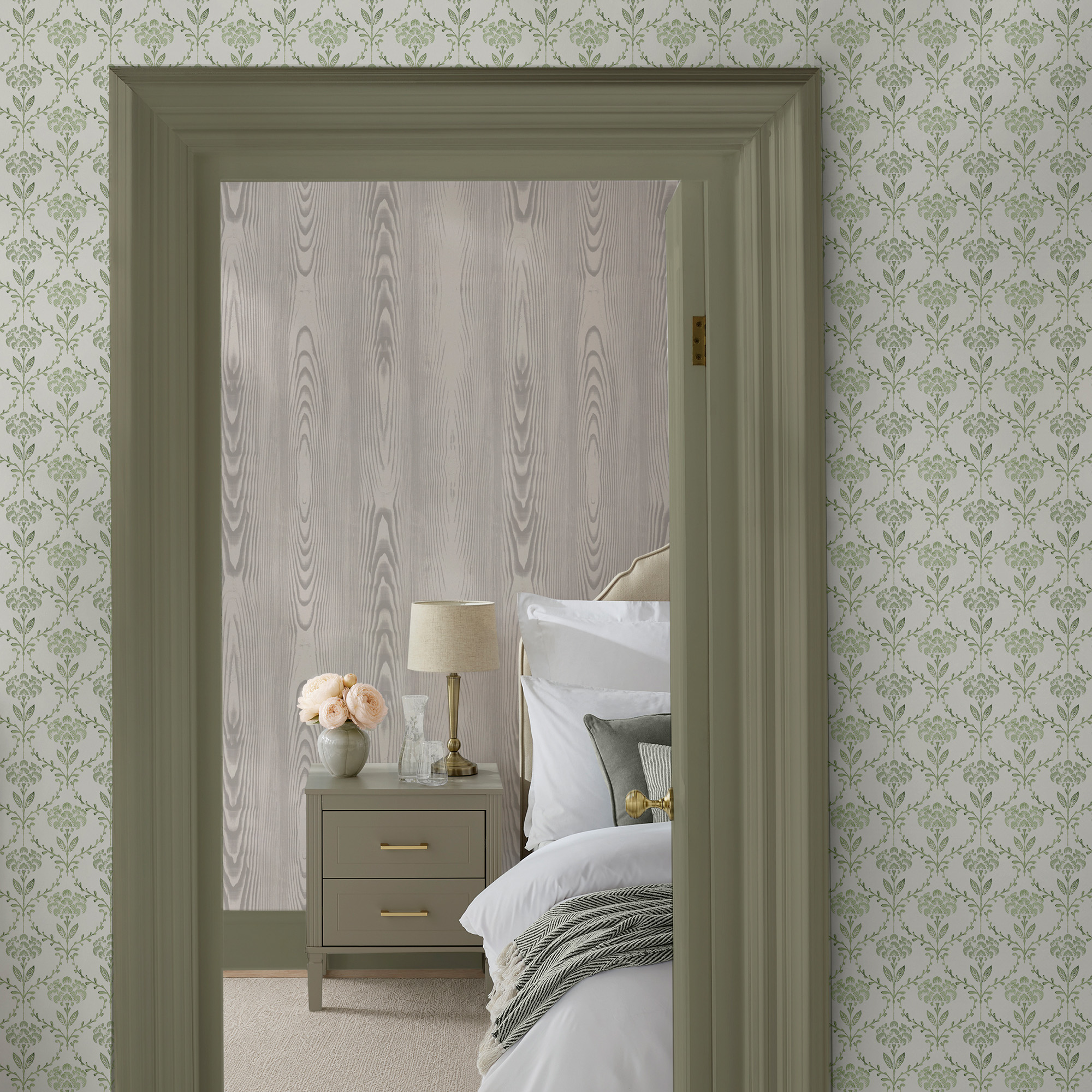
Sage is the lighter, softer green of the two and appears on the collection's wood-effect designs: Martha Stewart Wood Panel Sage, a printed take on traditional paneling, and Martha Stewart Bedford Faux Bois Sage, a smooth-finish paper with the look of softly grained wood. Both are the most restful greens in the range and the closest match if "sage green wallpaper" is exactly what you typed into the search bar.
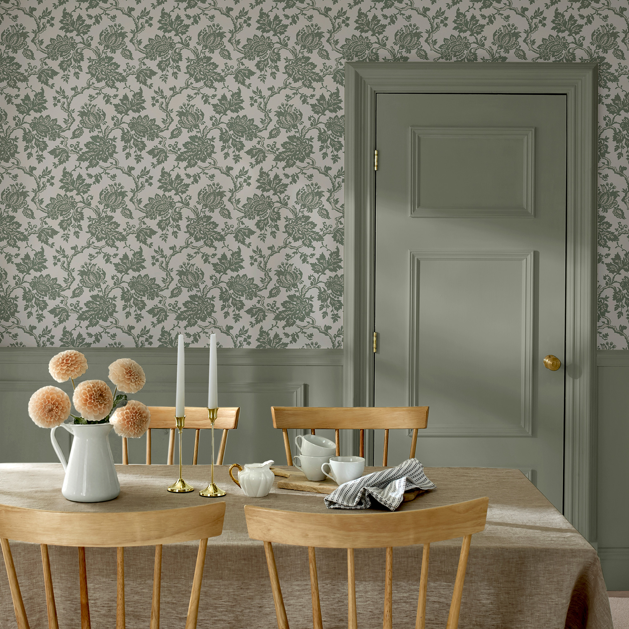
Moss is deeper and sits on the collection's more decorative patterns. It is the green you want when you are after moss green wallpaper with a bit more presence: Martha Stewart Floral Vine Moss with its twisting vines and small birds, Martha Stewart Florentine Moss, an archival-inspired damask, and Martha Stewart Heritage Garden Stripe Moss, which weaves ditsy florals into vertical stripes.
Where do Antique Green and Basketweave Green fit?
Antique Green belongs to Martha Stewart Jacobean Antique Green, a detailed botanical with a generous 84 cm (about 33 in) repeat. The name signals an aged, heritage quality, so expect a green with more depth and history than Sage. It is the natural choice for a dining room or study where you want pattern with gravitas.
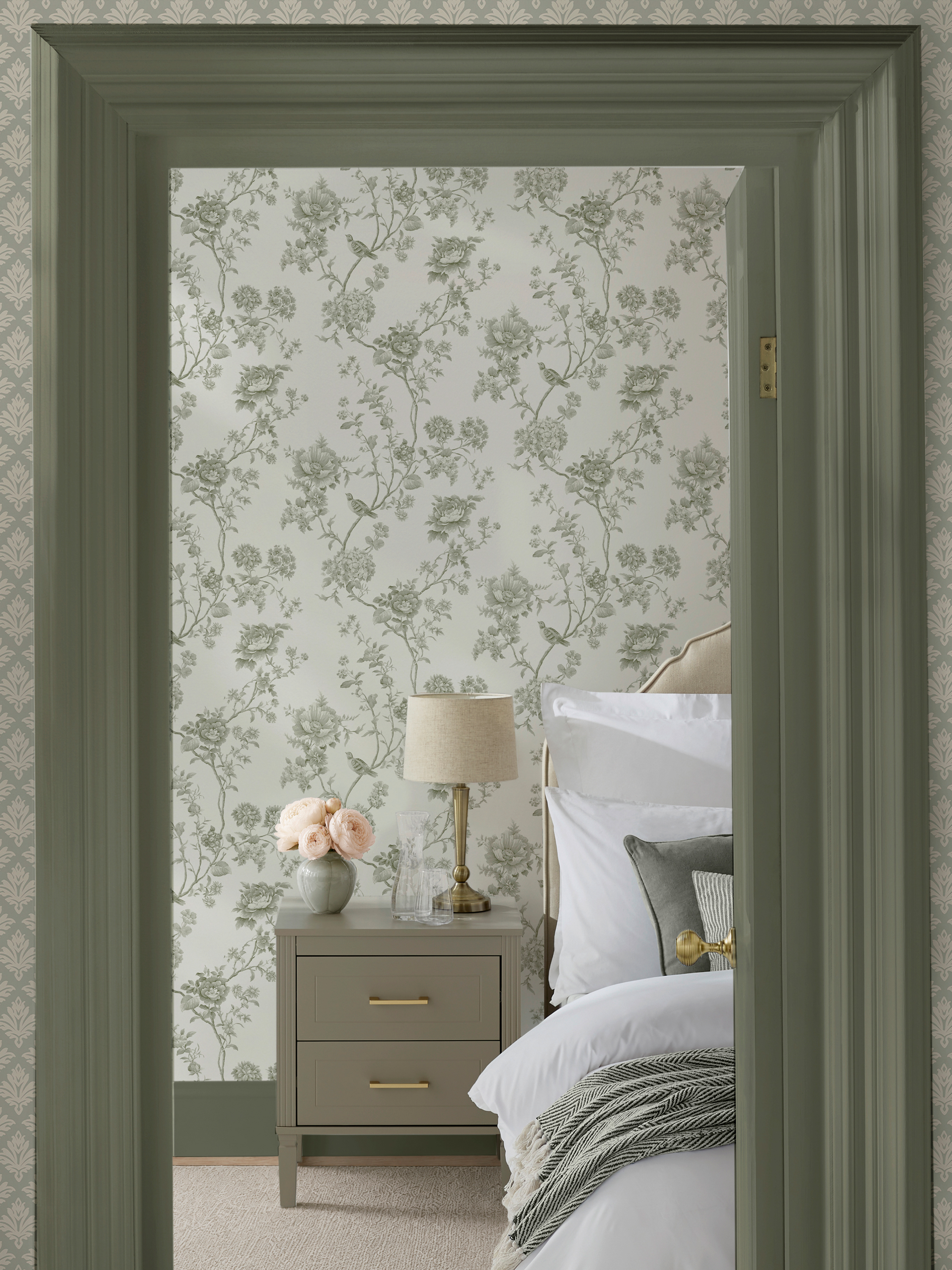
Basketweave Green is unique to Martha Stewart Chateau Fleur Basketweave Green, a traditional damask with a delicate lattice-like structure. The lattice gives the green a woven, textural feel, which makes it a clever bridge between a plain sage wall and a full floral.
Colorway | Designs available | Character | Best for |
Sage | Wood Panel, Bedford Faux Bois | Lighter, softer, near-neutral | Whole rooms, bedrooms, hallways |
Moss | Floral Vine, Florentine, Heritage Garden Stripe | Deeper, more saturated | Feature walls, living rooms, dining rooms |
Antique Green | Jacobean | Deep, heritage, large-scale | Dining rooms, studies, powder rooms |
Basketweave Green | Chateau Fleur | Textural, lattice-led | Bedrooms, dressing rooms, small spaces |
How do you use sage green wallpaper room by room?
Sage behaves differently depending on how much time you spend in a room and how it is lit. Here is how to approach each space.
Sage green wallpaper bedroom ideas
The bedroom is where sage earns its reputation for calm. Paper all four walls in Wood Panel Sage or Bedford Faux Bois Sage for a cocooning, cabin-like effect, then keep bedding in white or oatmeal linen so the room never feels heavy. If you prefer pattern, Chateau Fleur Basketweave Green behind the headboard gives you a focal point without disturbing the rest of the room. Brass bedside lamps and a walnut nightstand add just enough warmth. For more schemes, browse our favorite bedroom wallpaper ideas.
Sage green wallpaper living room ideas
Living rooms take a little more energy, so this is where Moss comes into its own. Floral Vine Moss on the wall behind the sofa, cream upholstery, a terracotta throw and a large oak coffee table is a complete, grown-up scheme. If you would rather paper every wall, Wood Panel Sage gives the room the warmth of a paneled library at a fraction of the effort, and it pairs beautifully with leather and dark wood. Our guide on how to choose wallpaper for a living room covers scale and placement in more detail.
Kitchens, bathrooms and hallways
In a kitchen, sage against white cabinetry and pale stone looks fresh and considered; Heritage Garden Stripe Moss on a single wall adds structure without competing with open shelving. In a bathroom or powder room, Jacobean Antique Green with brass fittings creates the kind of jewel-box space guests remember. Hallways benefit from the lighter Sage colorways, which keep a narrow space from closing in. Every paper in the collection is spongeable, so light marks in high-traffic areas can be wiped with a damp sponge.
How does lighting change the way sage green looks?
Of all the popular wallpaper colors, sage is one of the most sensitive to light, because the gray in it shifts with the color temperature of whatever is illuminating the room.
- Check the room's aspect. North-facing rooms receive cool, bluish daylight that pulls sage toward gray and can make it look flat. South-facing rooms bathe it in warm light and bring out the green.
- Choose warm bulbs. LED bulbs labeled 2700K to 3000K (often called "warm white") flatter sage. Anything above 4000K reads cold and clinical against it.
- Test the sample at three times of day. Tape it to the wall you plan to paper and look at it in the morning, late afternoon and after dark with the lights on.
- Compensate with the scheme. In a cool-lit room, lean into brass, warm wood and cream. In a warm-lit room, white and navy stop the green from turning muddy.
- Consider the colorway. The deeper Moss and Antique Green hold their character better in low light; the lighter Sage colorways reward a bright room.
If you are papering one wall only, light also decides which wall. Our post on what wall should be a feature wall walks through the options.
Green wallpaper ideas beyond sage
Sage is the gateway, not the whole story. Once you are comfortable with it, the wider green wallpaper collection at No Two Houses opens up deeper forest tones, olive, and botanical patterns in every scale. Within the Martha Stewart range alone you can move from a near-neutral Sage wood-effect to a richly patterned Moss floral without changing your furniture. Staying inside one color family like this is the easiest way to layer pattern across a home: a sage hallway leading to a moss living room feels intentional, as if the rooms are in conversation.
Frequently asked questions about sage green wallpaper
Is sage green wallpaper still in style?
Yes. Sage has moved from trend to staple because it works like a neutral: it flatters wood, brass, white and most textiles, and it suits both traditional and contemporary rooms. Colors with that kind of flexibility rarely date.
Does sage green make a room look smaller?
Not in its lighter forms. Sage reflects more light than deep forest or navy, so a small bedroom or hallway papered in Wood Panel Sage or Bedford Faux Bois Sage will feel calm rather than cramped. Save the deeper Moss and Antique Green for a single wall in smaller spaces.
What is the difference between sage green and moss green wallpaper?
Sage is lighter and grayer, closer to a neutral. Moss is deeper and more saturated, with more visible green. In the Martha Stewart collection, Sage appears on the wood-effect designs and Moss on the florals, damask and stripe.
Can I use sage green wallpaper in a bathroom?
Yes, provided the room is well ventilated. Every Martha Stewart design is non-woven, paste-the-wall and spongeable, which suits a powder room or a family bathroom with good extraction. Avoid papering directly inside a shower enclosure.
How many rolls of sage green wallpaper will I need?
Every Martha Stewart roll is 52 cm × 10 m (about 20.5 in × 32.8 ft). Measure the width and height of each wall, allow for the pattern repeat listed on the product page, and read our planned guide to how much wallpaper you need for the full method.
Ready to see sage green on your own walls?
Color this subtle deserves to be judged in your light, not on a screen. Order samples of the Sage, Moss, Antique Green and Basketweave Green colorways from the Martha Stewart wallpaper collection, tape them up where they will live, and watch how they change through the day. When one of them makes the room feel settled, you have your answer.
